Choosing the right colors for hand embroidery
Table Of Content
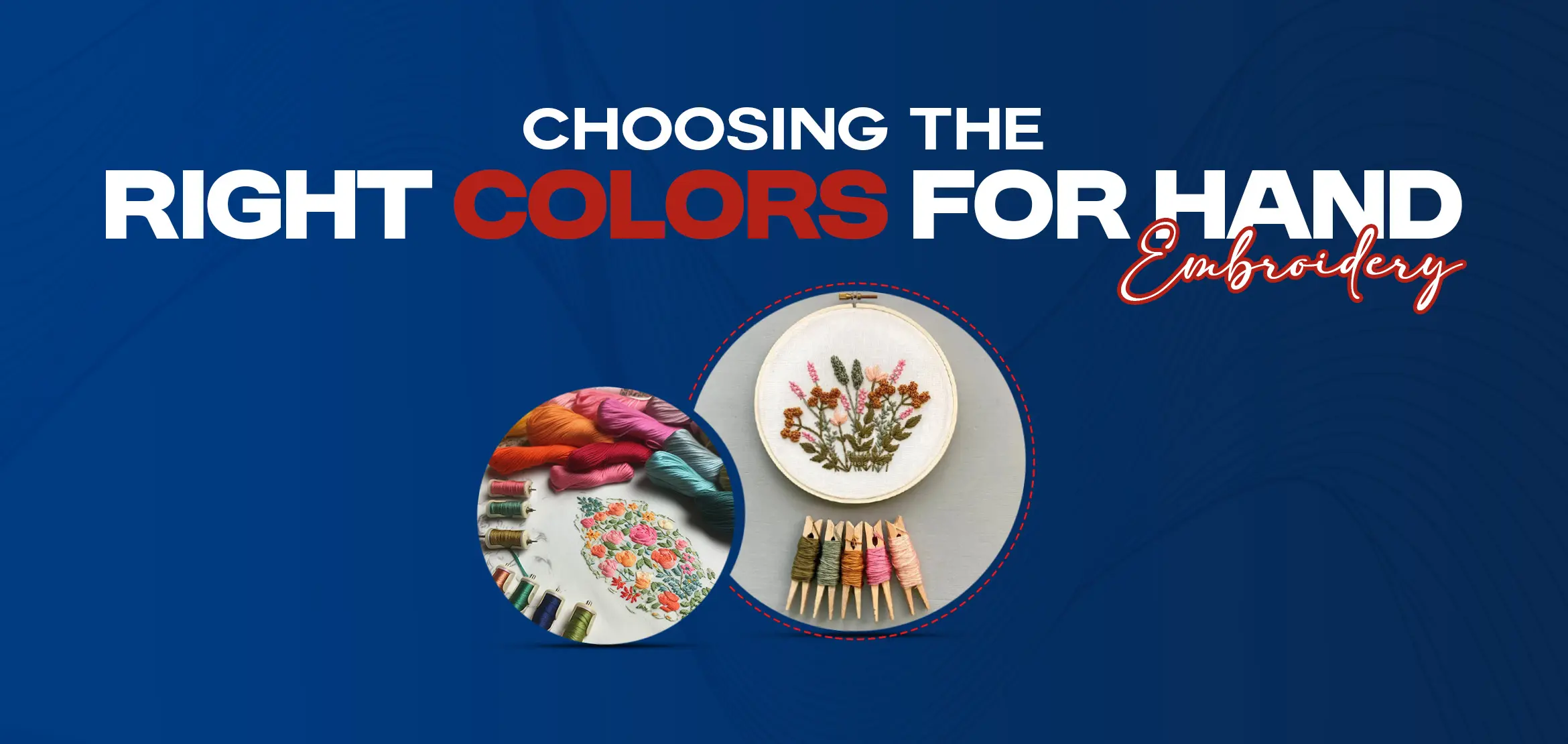
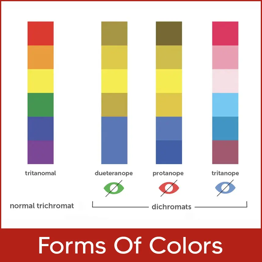
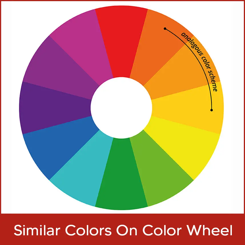
Colors play an important role in hand embroidery. It establishes the tone for the entire work. Bright colors add playfulness and cheer, while dark colors can add sophistication. This blog will quickly go over some color elements and provide ideas for choosing a palette for the project. Color will undoubtedly be one of your biggest influences in a design, so choose wisely. Color is not taken lightly when designing for commercial embroidery. Many patterns call for specific colors—skin, leaves, fruit, and so on. That doesn't mean your colors are predetermined. With hundreds of colors of Royal Polyester Thread alone, the possibilities are endless. The adventure begins when you discover variations on the fundamentals. Instead of using the "true" version of a color, try a shade lighter or darker. Use different strengths of the triadic colors red, yellow, and blue. Color temperature is another consideration when selecting colors. Blues and greens, for example, are considered "cool," while reds and oranges are considered "warm." Each color has warms and cools that can be found using a color wheel. 1. Tint (Light): Add a small amount of white to any color to make it lighter. When the colors appear softened and lightened, you can identify the lighter shade. These hues are commonly perceived as calming, soothing, loving, innocent, cherubic, Misty, soft, mellow, and sweet. 2. Hue (Vivid): The true color in its purest form. It is the hue and true representation of the color, and its vibrancy draws your attention immediately. These colors are thought to be lively, passionate, alive, young, energetic, playful, happy, festive, and exciting. 3. Tone (Muted): Adding a degree of grey to the hue produces a muted version that establishes the color's tone. It has a worn-out or washed-out look to it. They are perceived to be organic, natural, old, faded, rustic, worn, intellectual, boring, and dull. 4. Shade (Dark): To get a dark shade, add a degree of black to the hue. Similar to how different materials soaked in water turn it a dark color. These colors are associated with mystery, seriousness, complexity, tradition, history, sophistication, wealth, and elegance. Now that we understand how colors interact, we can move on to creating a palette for our embroidery project. In other words, let's see how we can use what we've learned to help us choose colors for anembroidery project. Remember that whatever color combination you choose will take into account all four forms of each color. This does not imply that you will use all of the tints, hues, tones, and shades of the colors you have chosen, but rather that you will have the option to choose from among them. The color of your background or fabric will also influence the combination you choose. Monochromatic: Choosing a monochromatic color for the project means you'll be experimenting with the tints, hue, tones, and shade of only one color in the same project. Triad: These colors are separated by three different colors. You can mix and match the tints, hues, tones, and shades of these three colors. Analogous: These colors are neighbors and create a very harmonious color combination. Use a combination of these related colors' tints, hues, tones, and shades. These colors are complementary because they are on opposite sides of the color wheel and intensify each other. To set the mood of the project, various combinations of tints, hues, tones, and shades of these colors can be made. Colors that are analogous to one another are more detailed than colors that are complementary to one another. On a color wheel, they are three colors next to each other. Yellow-green, yellow, and yellow-orange are three examples of yellow colors. You can mix analogous colors, but it also helps to include a complementary color. It would be nice to pair one of the yellows with a purple; the complementary color will look great! Many triadic color schemes can be used to create a slight contrast, almost like a split-complementary color scheme, while remaining balanced. The most well-known triadic colors are red, yellow, and blue. It is normal for choosing a palette to take some time. These methods will assist you in makingcolor selection easier and faster. You will only improve with more practice and experience. Play with colors without fear and develop your own style. Choosing the right colors for hand embroidery is more than just picking what looks good, it’s about setting the mood, creating balance, and bringing designs to life. Whether you’re experimenting with tints, hues, tones, or shades, the right color palette can transform a simple project into a masterpiece. With practice, you’ll gain confidence in mixing colors and develop your own unique style. And when it comes to turning those beautiful color choices into professional embroidery digitized designs with software programs, look no further than Digitizing USA. We specialize in providing top-quality embroidery digitizing services in the USA, making sure every shade and stitch comes out with precision. From hats to apparel, our expert team delivers fast turnaround times and flawless results, helping your designs stand out in every thread. Trust Digitizing USA for all your embroidery digitizing needs and let your colors shine like never before.Forms of Colors
Color Theory
Similar Colors on Color Wheel
Tridic Colors
Conclusion
